Interactive Plotly charts rendered straight from the attributes of layers already on the map — with the signature bidirectional chart↔map selection that made QGIS DataPlotly beloved. Box-select outlier poles in a scatter plot and they highlight on the map; select features on the map and the chart redraws. Same desktop, zero cloud.
Pick any feature layer on the map, choose fields and a plot type, and chart it in an in-map floating panel. Selection is a first-class citizen: chart, map, and select tool all share one app-level selection state.
/api/charts/configs) — your inspection-backlog histogram is one click away tomorrow.// scatter: pole height vs year installed layer: distribution_poles x: install_year y: height_m lasso-select 14 outliers → 14 features highlighted on map → "Also filter layer" ✓ — map shows only them ● saved "pre-1990 tall poles" /api/charts/configs
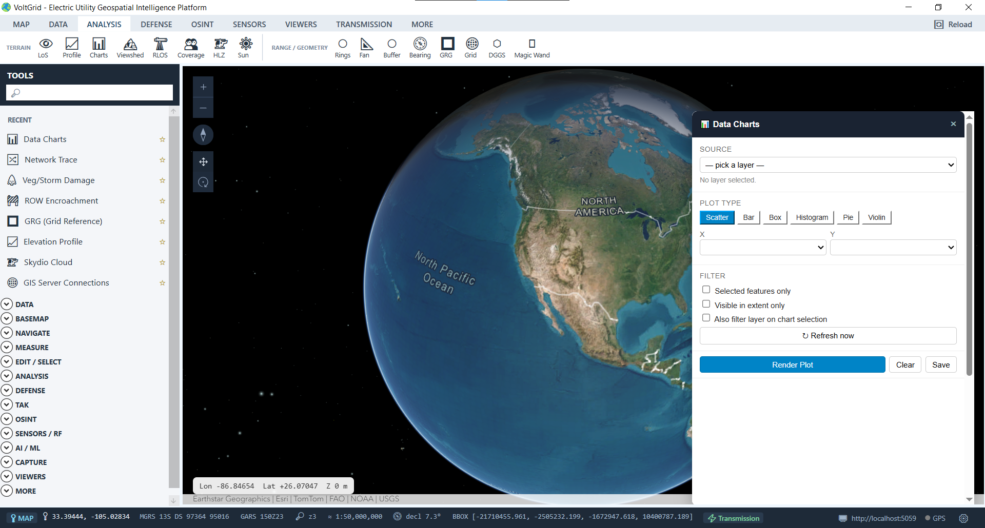
Histogram the inspection dates, lasso the overdue bin, and the map shows exactly where those poles stand — ready for a route plan.
Box-plot clearance findings by severity or circuit and click straight from a distribution outlier to the span that produced it.
Charts read and write the same selection registry as the select tool — the chart, the map, and future export tools all agree on what's picked.
Honest boundary: Phase 1 charts feature layers and graphics layers on the map; charting raster statistics and standalone files (CSV without loading as a layer) is roadmap — not shipped.
